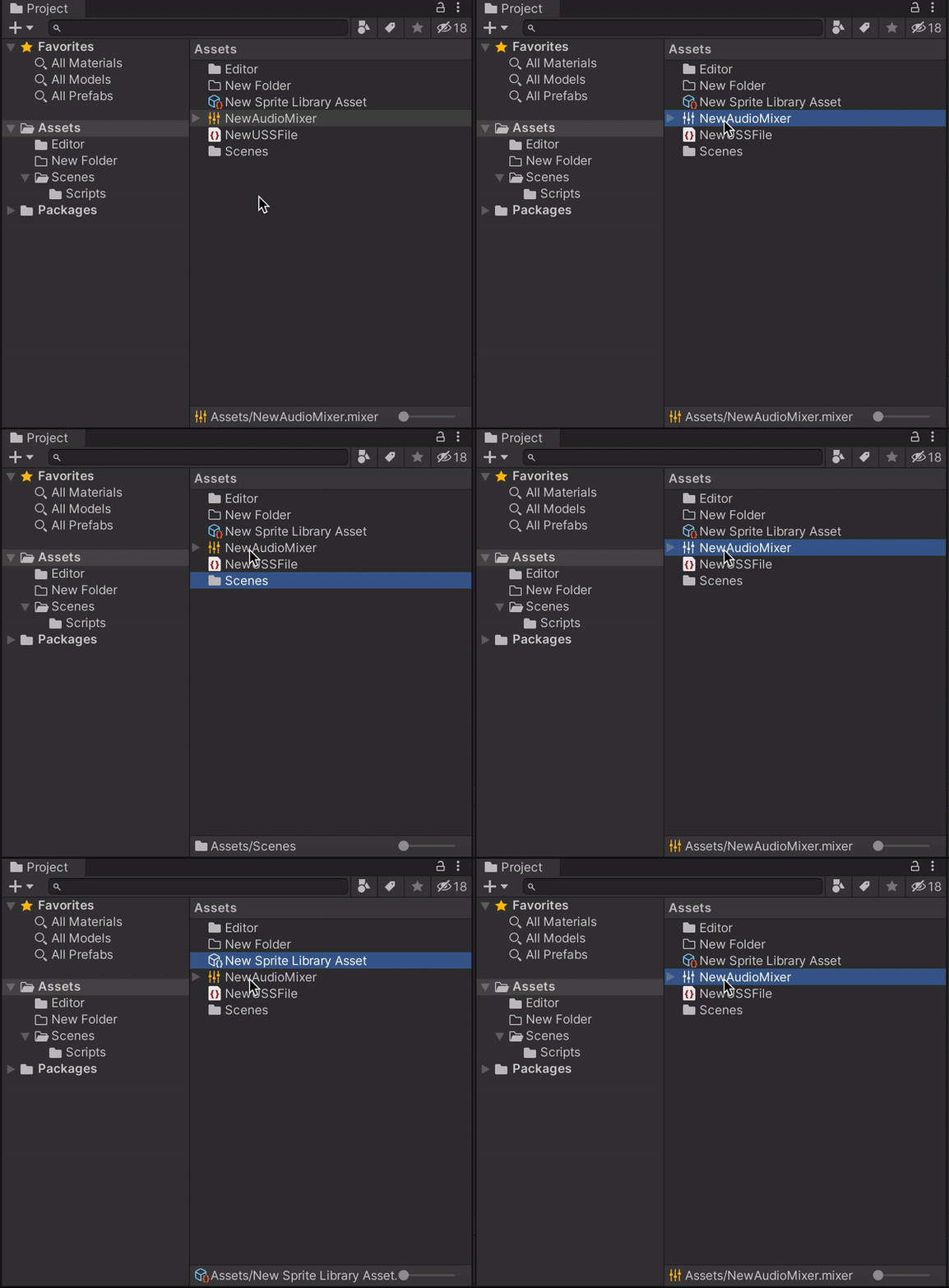
Not sure if it’s related to 2020 beta - some icons in the project window have colors, but when selected they turns black/white.
What is the reason for that ? at these times we need some color in our lives 
I created this amazing GIF to demonstrate the issue.
BTW - the USS asset still has colors when selected …
To quote one of our UX designers who worked on this feature, this would be by design, for cases when the color of the icon can’t be seen (any shade of yellow will not show on blue). The first priority is to ensure the icon is visible with a min contrast ratio of about 3.5:1 or higher and the second priority is to to maintain the consistency of the icon when possible (i.e. the light grey folder icon). I hope that answers your question, thanks!