It appears to me that the the default font size is 13pt and that Unity creates a 1 meter (well, 1 Unity unit, which translates to 1 m on the HoloLens platform, which I am developing for) tall bounding box around this. Therefore, there are (1/13) points/meter.
However, it looks like there is some padding on the top and bottom of the text, which in turn is different from the line spacing. It appears to me that the actual height of each line has to be computed as:
(1/13) * (font size in points) * 1.5
Is there an explanation of font sizing anywhere? The documentation does not have it. I want to make sure I understand what this 1.5 factor is and whether the 13pt → 1m scaling is truly correct (it appears to be based on some simple experimentation I’ve done).
Thanks,
Bart
EDIT: Okay, my logic is obviously wrong. This only works for Arial. The bounding box is quite different for different fonts of the same point size, so I’m not sure what’s going on. The reason I’m asking this question is because I’d like to programmatically and manually place subsequent lines of text as separate text meshes exactly correctly.
I would suggest you take a look at TextMesh Pro and use the normal TextMesh Pro component which is designed to replace the old Text Mesh.
When using TextMesh Pro, you can use TMP_Text.preferredWidth and TMP_Text.preferredHeight or TMP_Text.textBounds or TMP_Text.meshBounds.
TMP_Text is a reference to the base class which both TextMesh Pro component inherit from. The component type is the replacement for the old TextMesh and the is the replacement for UI.Text.
TextMesh Pro is available for free in the Asset Store.
I will give this asset a try in the near future, thanks! For now, I’ve been making due with the following to compute size at run-time, but I don’t understand what the factor of 0.1f is necessary for (I found it elsewhere on the Unity Forums but without any explanation – I’ve confirmed it is correct for different fonts and styles):
    // Text mesh size
    foreach (char symbol in textMesh.text)
    {
      CharacterInfo info;
      if (textMesh.font.GetCharacterInfo(symbol, out info, textMesh.fontSize, textMesh.fontStyle))
      {
        width += info.advance;
      }
    }
    float finalWidth = width * textMesh.characterSize * textMesh.transform.lossyScale.x * 0.1f;
I stumble upon this problem when developing AR/VR applications as well. With Unity UI Canvas, if the text is 22 pt, then the text is 22 meters high, which is very consistent and easy to understand. But what it is the case with TextMesh or TextMeshPro? Why font size 13 occupy 1 meter(According to Microsoft HoloLens documentation)? Is it exactly 13pt? Where is the documentation for this?
Would really love to know. This is extremely important to us.
First, it is important to understand that fonts come in all shapes and sizes where the decision in terms of the visual design and metrics of the font is up to the designer.
Here is an example of 5 different fonts (picked sort of randomly) at 48 pts in MS Word. These are Calibri, Arial, Consolas, Times New Roman and Impact.
As you can see their height and metrics vary greatly from one another.
The height of a font is the Ascender Line which should represent the highest / tallest point in the font. The Descender line represents the lowest point of all descenders in a font.
The Ascender Line measured from the Baseline. The height of a character is measure from its Ascent line to its Descent line.
Most fonts are designed with some EM scale / Units per EM. With that information along with the metrics, you can calculate the size of individual characters in terms of pixels. See the following post of mine .
Using that information, you could normalize your font assets by adjusting their scale in the Font Asset Inspector so that all of them regardless of design metrics end up the same size using the same point size. Note this would make this fonts no longer true to their design but you could adjust them to be whatever Unity scale you needed.
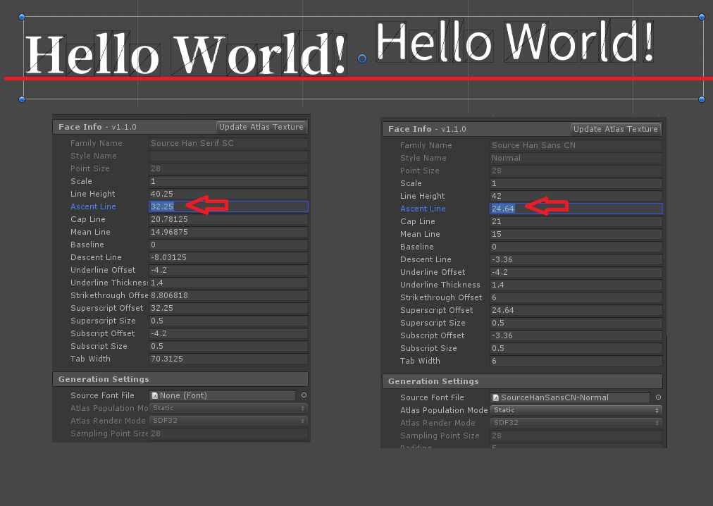
Sorry to hijack this post. Since it was talking about the Ascender Line, I would like to ask about how this value was calculated. Because this value cause very different result for text with same size. Here is a sample rendering result for a text string with same font size (30pt). Those two font assets also have same sampling point size (28pt)
They are both from Source Han fonts for CJK characters. But ‘Ascent Line’ for Serif SC is much bigger than Sans, and causing an extra spaces on top of each line. You’ll find the result on left side is not vertically align with the right one, not even close. I’m not sure whether this is the correct ‘Ascent Line’ value, because the text rendered by WPF or Photoshop won’t give such different result, the characters almost have same ascent height in these softwares. Also the ‘Line Height’ for these two font assets are very close (40 vs 42), and this ‘Line Height’ values are close to WPF/Photoshop result.
In SerifSC font, lineHeight = 1151+286 + 0 = 1437, and Ascent Line = 28 * 1151 / 1000 = 32.22, the same result showing on Unity inspector. In Sans the lineHeight=880+120+500=1500, and Ascent Line=28*880/1500=24.64.
So the Line Height is almost the same, but ascender value is very different. Then the question is 'How WPF and Photoshop rendering the expected result but TMP will render extra space by using the Ascent Line value?
The difference of the 1st baseline position is caused by an old font data. If using v1.004 for Sans font, the result in TMP will also be aligned. But the extra space for the 1st line seems to be a design choice according to this article: https://glyphsapp.com/tutorials/vertical-metrics May be users should just manually adjust the
‘Ascent Line’ property to trim the top margin for the 1st line.