Hello Everyone,
I’m trying to create a custom control with several containers. Is this even possible? I understand that in UXMLs we can set content-container=“true” for a single element and we can do the same by overriding contentContainer property in c#, but I couldn’t find any example for a custom control with multiple containers. Currently I’m simply overriding the contentContainer:
public override VisualElement contentContainer
        {
            get
            {
                if (SwitchContentContainer)
                {
                    if (TriStateSwitch.State == ThreeStateLabel.SwitchStates.LEFT)
                    {
                        return _space1;
                    }

                    if (TriStateSwitch.State == ThreeStateLabel.SwitchStates.Middle)
                    {
                        return _space2;
                    }

                    if (TriStateSwitch.State == ThreeStateLabel.SwitchStates.RIGHT)
                    {
                        return _space3;
                    }
                }

                return this;
            }
        }
This works in UI Builder, and I can add elements to the intended spaces there. But the moment I save or reload the UI Builder, all the added children flock to the space associated with the last selected state (please see the attached image). I’m familiar with load resource approach and this is not what I’m after. I will appreciate any advise on this subject.
Now, I don’t know what you are doing (and maybe you could provide more info regarding this), but you could possibly just create your custom control expecting 3 children, and provide 3 empty visual element in the hierarchy that you use to populate the different sub-hierarchies.
The content container is only a shortcut for loading the code in the right element when the object represents a complex hierarchy. For example, in a split view, you don’t want the children serialized in the uxml to be part of the scrollbar, and you do want the scrollbar. So in this case, the content container helps to locate where to put the children. It is also used when you are doing visualElement.Add but on the c# side you could always supplement your custom object with customElement.AddToFirstPane as a helper method.
This pattern with multiples object is how I think tabbed windows and group box are made.
If you need more help with this, don’t hesitate to follow up with more question or specific use cases you would like to do.
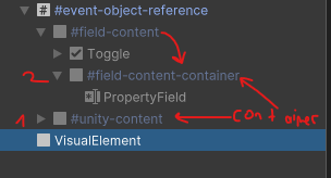
I created something like this.
The #event-object-reference’s content container is #unity-content. #field-content’s content container is #field-content-container.
This would work in codes. But i want to manage it from the UXML editor. In UXML editor, i cant drag elements into #field-content or #field-content-container. It only accepts #unity-content which is sounds absurt.
I’m having the same problem I think. I have a custom Visual Element with more than 1 child element that I want to be able to drag other elements under in UI Builder. In other words Element A is a custom C# visual Element with a UxmlFactory so it shows up in UI Builder. It has 2 children, B and C. I want to be able to drag other elements in UI Builder to be children of either B or C but both are greyed out in Builder.