Recommended way(s) to handle UI buttons that are large enough on tablet but too small on phone?

It’s silly, but only now have I realized that some of my buttons may be too small on phone while they’re large enough on tablet. (Fortunately I’m still early on, so not a lot to change.) Currently, I’m testing using Device Simulator on iPhone 13 Pro Max and iPad 12.9 (2018), and on my own personal Lenovo Tab P11 Plus (just those for now to keep things simple). Only landscape mode will be used; portrait mode is disabled.

For the Canvas, I’m using “Screen Space - Camera”. For the Canvas Scalar, I’m using “Scale with Screen Size” with a Ref Resolution of 1440x1080, and a Screen Match Mode of 1 (matching height).
I’m trying to size the simulator window to semi-accurate physical sizes.

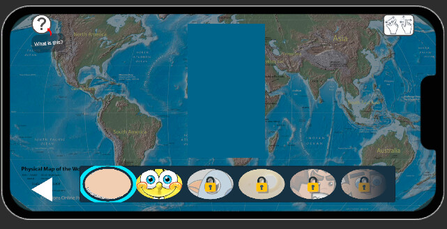
For now I’m just focused on the bottom-left Back Button. For the iPad, the back button seems fine / large enough:

But for the iPhone, I think it’s a bit too small:

For the iPad (and my Lenovo Tab), I’d prefer to keep the button the size it is currently, but on the iPhone I’d like to resize the button to be a bit larger.

Is this an appropriate way to handle this situation? If so, is there even a way to determine if the physical “height” (technically the width because Apple uses portrait mode as default) is small enough to warrant making the button larger?

These are inaccurate apparently:

float ScreenWidthInch = Screen.width / Screen.dpi;
	float ScreenHeightInch = Screen.height / Screen.dpi;

The code example here apparently doesn’t always work:
Unity - Scripting API: Screen.dpi

Do I just have to personally get and store a list of device physical sizes (or a list of accurate DPIs) from manufacturers’ websites? Tbh, that seems like an unreasonable amount of work, or work that somebody else has already done.

Thanks for any help.

1 Like

The way to go for this usually is keeping constant physical size on the canvas. This makes the scaler calculate the size based on the device’s reported screen size and dpi and have roughly the same size on any device.
The downside is webGL or desktop don’t report very well or at all the real screen values, and the scaler will use a reference DPI that may or may not be correct (it will use the same in a 32 inch 4k display and a 13 inch laptop). But for mobile it usually works well enough.
Also if you use any constant size (there is also constant pixel size, not recommended for mobile as you will have very different sizes based on the device resolution) you have to be more aware of using anchors instead of X/Y positioning, as screen sizes and ratios can be very different.

1 Like

Thanks for reply. You actually made me realize I had too many canvases, so hopefully that improves performance by reducing overdraw.

I’ll admit I was hoping for an answer that allowed for a bit more control over the size, because on phones I just wanted to size it up a bit more.

That said, I am willing to try physical size, but this is the difference for the back button (red arrow pointing at) when I try iPad Pro 11-inch (M5) and iPhone 13 Pro Max:

For some reason it shows much larger on phones. Any idea what’s going on? Does it have to do with the DPI?

Here’s the Inspector:

This is only something I just thought of now upon seeing https://stackoverflow.com/a/72540544 - for now, I think I’ll just check the aspect ratio; if it’s past like 1.8 or 1.9 I’ll assume it’s a phone, otherwise tablet. I’m sure it’s not perfect, but it seems like the closest reasonable option. (I still think I might eventually have to compile a list of accurate DPIs and get the appropriate DPI based on device name or key words.)

With constant physical size it is expected to see it larger on emulator, as the phone is smaller than an iPad.

What constant physical size does is keeping the real size the same across devices. If you measure the button with a ruler in one device and the other, the number should be the same (2cm/1 inch or whatever). Or you could use the scaler physical unit and design in real size units instead of points.

If you want a real different size on both devices you have to stick to default scaling, which can or cannot be enough (looks like it isn’t on your case), or design and mantain two different UIs and enable/disable canvases based on device (Application.IsMobilePlatform and aspect ratio), this way you can even have a landscape and a portrait design switching between two canvases.

Just be aware that aspect ratio by itself is not completely accurate. There are squared phones out there, 4:3 and 16:9 tablets, some weird aspects too, and nowadays with foldable phones the barrier between phone and tablet is more blurry than ever.

And if you want to use DPI by code, the device DPI is accurate always on Screen.dpi if it is provided. A simple 0-check will do

if (Screen.dpi > 0)
{
    // calculate based on device dpi
}
else
{
    // dpi is not reported by the device, fallback to defaults
}

Here is how I manage my UI for different device sizes. I set my Canvas to scale with screen size and set to 0.5 as default when setting UI. Once done my Canvas Scaler Helper script do it’s job based on screen size.

using UnityEngine;
using UnityEngine.UI;

[RequireComponent(typeof(CanvasScaler))]
public class CanvasScalerHelper : MonoBehaviour
{
    public enum AspectRatio
    {
        iPad = 1,
        iPhoneRegular = 2,
        iPhoneX = 3
    }

    private AspectRatio CurrentAspectRatio = AspectRatio.iPad;
    private CanvasScaler canvasScaler;

    private void Awake()
    {
        SetAspectRatio();
    }

    private void SetAspectRatio()
    {
        canvasScaler = GetComponent<CanvasScaler>();
        float aspect = (float)Screen.height / (float)Screen.width;
        if (Screen.orientation == ScreenOrientation.Portrait)
        {
            aspect = (float)Screen.height / (float)Screen.width;
        }
        else
        {
            aspect = (float)Screen.width / (float)Screen.height;
        }
        //Debug.Log(aspect);
        if (aspect >= 1.87)
        {
            //Debug.Log("19.5:9"); // iPhone X or Latest Android Devices
            CurrentAspectRatio = AspectRatio.iPhoneX;
        }
        else if (aspect >= 1.74)
        {
            //Debug.Log("16:9"); // Standard HD resolution 1080*1920
            CurrentAspectRatio = AspectRatio.iPhoneRegular;
        }
        else
        {
            //Debug.Log("4:3 or other");
            CurrentAspectRatio = AspectRatio.iPad;
        }

        if (CurrentAspectRatio == AspectRatio.iPad)
        {
            if (Screen.orientation == ScreenOrientation.Portrait)
            {
                canvasScaler.matchWidthOrHeight = 1f;
            }
            else
            {
                canvasScaler.matchWidthOrHeight = 0;
            }
        }
        else
        {
            if (Screen.orientation == ScreenOrientation.Portrait)
            {
                canvasScaler.matchWidthOrHeight = 0f;
            }
            else
            {
                canvasScaler.matchWidthOrHeight = 1f;
            }
        }
    }

    private void OnRectTransformDimensionsChange()
    {
        SetAspectRatio();
    }
}

1 Like

So the emulator just makes it look much bigger than it would actually look on the iPhone? In the emulator, it just seems too big on the phones, and makes it hard to plan for the layout design. But maybe I just really don’t want to use physical size in this case.

I’m just targeting landscape for now.

I guess I’m just not going to be able to target every single device automatically. I suppose for now I’ll just target the most common phones and tablets (iPhone 13-16, iPad 9th and 10th gen, Samsung Galaxy A, etc.). A shame this is difficult.

“4:3 and 16:9 tablets” - well, my code would catch those anyways since I’m assuming greater than those aspect ratios (long side / short side; 1.85 or greater) is a phone. Or maybe you meant to say “4:3 and 16:9 phones”.

Unity - Scripting API: Screen.dpi says that on Android the DPI isn’t always accurate; should I consider the densityDpi number accurate enough though?

Edit: I suspect Screen.dpi may be good enough for what I’m doing here.

“Alternatively, you can calculate the DPI value using an average of xdpi and ydpi as shown in the following code example. While this approach might provide more accurate DPI value, some Android devices might report incorrect xdpi and ydpi values. It is recommended to account for these inaccuracies when following this method.” - How do I account for the inaccuracies?

Thanks for the code suggestion, I may try implementing something like this.

Edit: Just FYI though, at a glance it looks like you could use switch statement(s) instead of if else.