Is it possible with text mesh pro to specify an alpha value using the rich text format? For cases where one would want to fade in characters perhaps one at a time? Also, how realistic would it be to use TextMesh Pro with very large atlases, such as the case of asian characters?
And, I suppose importantly, what shader version must be supported for this?
Currently, you can use color tags in hex format. “The color is <#ff8000>Orange.” was used for the text below.
The current color tags don’t support alpha but support for alpha could easily be added by either adding an additional hex pair to the color tag like <#00FF00ff> which is fully opaque green or by adding a new tag <alpha=128> to control just alpha or both.
In terms of pulling off the fading effect. Let me begin by showing this recent addition which was requested by a user on the TMPro Forum last week which enables control / animating how many characters should be displayed. This functionality was also expanded to allow control over lines to be displayed.
In terms of fading one character at a time, I don’t think that you would want to insert tags for each as manipulating strings too friendly with GC. Similar to the effect above, I would want to control this via scripting but I would have to think about a nice clean way of implementing it.
This is an area where Signed Distance Field is very nice as Font Assets are generally smaller in size (texture size) vs. bitmap counterpart.
TextMesh Pro SDF Font Assets look great at any point size. The full ASCII set for many simple fonts can easily fit in a 64Kb (256 X 256) whereas the bulk of all other fonts in a 256Kb (512 X 512). Although we could technically fit over 10,000 characters into a larger atlas, very few games / products require all those characters. I added the ability for the user to supply a list of the characters that need to be included in the Font Asset which makes this more manageable. Please see the following post in our WIP Thread which provides more information on this topic.
Animating Material Properties in TextMesh Pro
Most material properties can be animated in TextMesh Pro via scripting. Below we have an example of animating the “_GlowPower” to create a pulsing effect.
Again, it is important to note that these visual effects are all real-time and fully dynamic. The Font Asset used is still the same that was used to create the first Red Zone examples. The only difference is that we are using different textures and material settings.
Love your asset. The text looks fantastic and excited you’re part of the 4.6 beta. It’s obvious you’ve put GOBS of time into it, and yet, as I typically pay $10-$30 for assets, it’s a problem of expectations. Similar to how mobile users expect our games to be Free. I’m not willing to take a $65 risk on what is probably a passing curiosity that isn’t required by my project. I’ve made other purchases that performed poorly on mobile, or added many hours of frustrated distraction.
In the end, I did not purchase your asset and wanted you to know why.
I understand. We all have different perception of how much something might be worth to us and how much we are willing to invest / risk to ultimately find out.
In terms of the value of TextMesh Pro, putting aside the fact that it will make all your text look significantly better. Provide you with enhanced text layout options, kerning, etc… For me just the amount of time I had to spend in external tools to create & texture my fonts would have been worth it.
Our mobile shaders were highly optimized for those mobile platforms. Even our shaders that are not labeled as mobile still perform great. Even our non-mobile Surface shader which is really designed for desktop applications, still only requires OpenGL ES 2.0.
In all performance tests, TextMesh Pro has outperformed or matched the performance of Text Mesh using Unity plain text shader.
I certainly appreciate the time you took to share your thoughts.
I bought the asset, and am really loving it. The text rendering is incredibly solid, looks visually great, and has lots of different options. There are some things I’d like to bring up though.
I would love a way to control the alpha value of individual text characters.
The ability to automatically shrink the text font size to fit if text exceeds the maximum length or line count would also be very nice… though I imagine this could be done manually.
Using the command with a negative value causes rather unpredictable results. I only bring it up because I tried it to see if I could use it to put a symbol on the left side of the margin and it caused really strange things.
It’s difficult to add a meaningful amount of underlay just using the shader for small text (where the shadow would need to be offset by a considerable amount to be visible), though duplicating the layer seems like a fairly reasonable alternative.
I am expanding the color tag to include a 4th hex pair for alpha. So now you will be able to use <#ffff0080> where 80 is the alpha value.
Although this would work to control fading of individual characters, I think it would be a pain to change all those individual per character color tags. I would like to add some method of controlling this in the API. I am still thinking about how to get it done nicely.
This feature will comes along when Unity 4.6 is released along with additional features. Take a look at this video preview of some of those new features as well as this other video.
The tag represents an absolute position like a hard tab stop. I doesn’t behave strangely with negative values. Let me look into that
EDIT: I isolated this issue and the fix will be in the next release.
I just added a new tag <space=000.00> which add x amount of space before the next character.
The Range that you have for Glow or Underlay is limited by the Padding / Spread that is used to create the font asset. Most of the time, a padding value of 5 is fine for most use. So if you need more range on your Glow or Underlay for instance create a new SDF Font Asset with padding of 8. You’ll see you get a lot more range.
So why not use padding of 8 or 10 all the time. This padding affects how large (point size) the font can be to fit inside a texture (512 X 512) for example. The larger the point size, the better sampling to compute the Signed Distance Field from.
It is a balancing act between those things. If I needed a Font Asset to be small 64 kb (256, 256) for the whole ASCII set, and wasn’t planning on really using Glow or much Underlay offset, then I would simply reduce the padding down to a smaller value.
What I have found is that a texture size of 512 X 512 with a padding value of 5 works great for most fonts with good range on Glow and Underlay for instance. The beauty of it all is that you can experiment with this and find the combinations that works best for you or any given font.
You control how much range you have for underlay, glow, outline and dilate in the material editor from the amount of spread available in the font.
Here is the max range of the underlay with a spread of 2 and 4 using a 256x256 Atlas.
Spread does reduces the resolution available for the glyph.
In this example this result in a native point size of 37 vs 29.
The trade of to get that extra range is almost 30% less resolution.
But no a bad trade of in this case, both look good at those sizes.
(You will need to really zoom in to start to see ‘tessellation’)
So the guideline is : Try to use the smallest size atlas, with the smallest spread.
Increase the spread if needed to extend the range of the : outline, dilate, glow, underlay features
If the text look tessellated, jump to the next atlas size 256x256 → 512x256 → 512x512
This will ensure you get the best resolution and range for your font.
Having said that, it can make sense to render in two pass VS one pass.
You can then use a material for your main typeface with a small spread,
and use another low res version with a large spread for special effects.
(super soft shadow, wide glow, …)
Another example using 2 layers (Same Arial font as above)
Ah great call on the padding, I didn’t realize the padding was related to the max size of underlay. The atlas I’m working with is… a bit huge (2400 characters) so it takes a very long time to generate so I hadn’t tried a higher padding. Oddly, most of the processing time occurs before the progress bar moves, and appears single threaded. Also, don’t try to set ‘auto’ size for 2400 characters, it will not end well.
And a large atlas with a decent spread will be heavy on your CPU.
If you drink coffee, time to go brew another pot
The long pause is the time taken to open the font.
Then the progress bar track the SDF generation of each character,
That part if fully multithreaded using Grand Central on OSX and OpenMP on Windows.
Speeding up this offline process was not a priority, its been quality over speed for asset creation.
But maybe a 2.0 feature request ?
Those fonts are a beast to open / load. I was shocked when I imported one of the Han Simplified into Unity and I had time to go eat a sandwich before it was done. It took like over 30 minutes.
Good call.
BTW: Instead of generating all 2400 characters, look into using in Character Set - Characters from File. That way you can parse the text in your game and only generate those characters plus some most common ones. This might help reduce this down to a smaller set.
Texturing Options
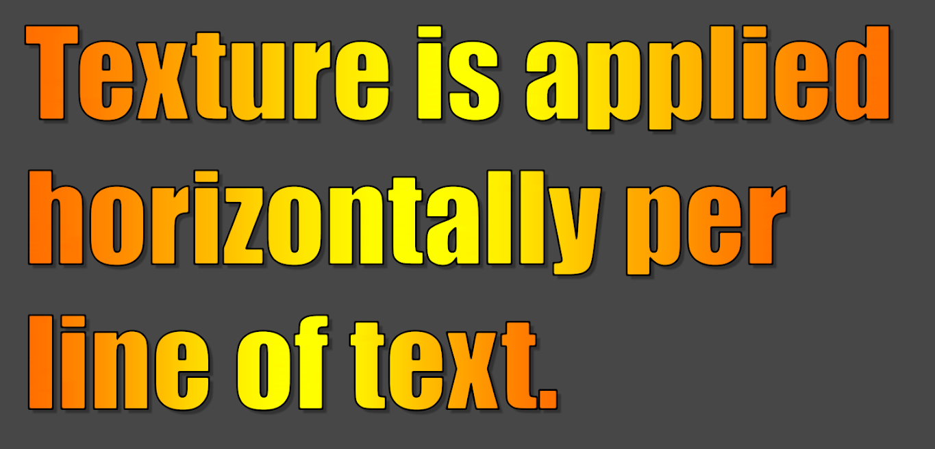
A feature of TextMesh Pro that is often overlooked is the ability to control how a texture is applied to the characters, lines or paragraph of text.
In this first image, we apply a simple grid like texture on the face of the characters mapped per character horizontally & vertically.
It is amazing how dramatically different a font can look after you have thrown a few textures, bevel, shadow and some little bump mapping on it. I’ll post the a screenshot of the Material Panel later on so you can all see the settings.
The creation of this Gold Material
Related to my post above, I wanted to show how this Gold material was created from the plain Impact SDF Font Asset. Once again, we are re-using the same (base) Impact SDF Font Asset. This is simply a new material with modified properties.
Here is an image of the text using this new Gold Material preset.