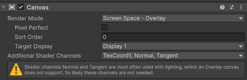
The Shader Graph team is excited to announce the release of our newest set of samples - UGUI Shaders - available to import now in Unity 6. This set of samples contains over a dozen user interface widgets, buttons, and backgrounds - all generated procedurally using Shader Graph. It also contains a library of more than 50 UI-specific subgraphs that you can use to build user interface elements. The sample shaders work in both HDRP and URP.

We have two main objectives with this sample set:
- Demonstrate Shader Graph’s ability to create dynamic, resolution-independent user interface elements in a wide variety of shapes and styles.
- Make it easier and faster to create UI elements by providing a large set of UI-specific subgraph nodes that can be used as building blocks to speed up the creation process.
Using Shader Graph and UGUI, you can create user interface elements that are resolution independent, require zero texture memory, can be authored and edited directly in Shader Graph inside of Unity, automatically adapt to aspect ratio, and contain all visual states and behaviors. That’s a lot, so let’s unpack it!
- Resolution Independent - These UI elements are procedurally-generated, so they look perfectly crisp whether displayed on a small smartphone screen or a 100 inch 8k TV. You can zoom in on them as close as you want and they’ll always be tack sharp.
- Zero Texture Memory - The visuals for these UI elements are created using math, so they don’t rely on textures at all. That means they require zero texture memory.
- Authored In Shader Graph - If you’re frustrated by the back and forth workflow of editing your UI images outside of Unity, chopping them up into textures, importing them, and then going back to make adjustments, you’ll be glad to hear that these UI elements are created entirely in Shader Graph, so there’s no export/import loop. Adjustments require simply changing shader parameters or re-wiring a few nodes.
- Automatically Adapt To Aspect Ratio - By passing the width and height values of the assigned UI element into the shader, the shader can automatically adapt the visuals to fit that ratio. No more making different button shapes to fit different size buttons or fiddling with 9 slicing.
- Contain all visual states and behaviors - One shader can contain all the information needed for a hover state, and active/inactive state, a pressed down state, etc, so you don’t need to manage multiple image assets for each button or widget.
This set of samples demonstrates how to use all of these advanced techniques for generating UI, and provides tools to make the process easier.
The Samples
The collection of samples includes examples of how to create backgrounds, buttons, indicators, and progress bars using Shader Graph. You can use them as they are, or modify them easily in Shader Graph. The samples are built using nodes from the Subgraph Library, so they serve as examples for how the Subgraph Library nodes can be used together.
Backgrounds - These shaders generally use Screen Space as coordinates. Most of them manipulate the appearance of the scene in some way - such as blurring it or pixelating it - so that the elements of the user interface can be added on top.

RectTransform Size - Many of the UI elements such as rounded rectangles need to adapt to changing aspect ratios. These samples show how you can use the included RectTransform Size node to pass in the width and height of the UI element so that the shader can adapt to fit.

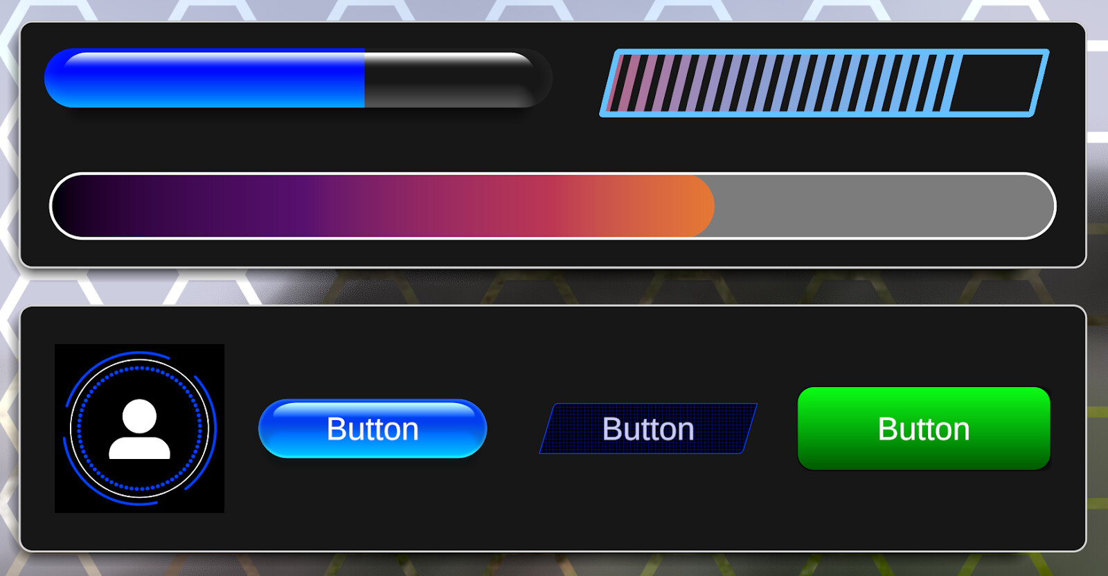
Meters - These shaders create meters that display specific information to the player - including health level, shield strength, mana, etc. Each of them has an exposed parameter that controls the level indicator and can be driven by game values through scripting.
Interactables - These shaders create buttons and other UI elements that the player can interact with. The buttons include exposed parameters for changing the state of the button including active, selected, and pressed. These parameters control the appearance of the button, so connecting these shader parameters to the button events allows the buttons to switch appearance states when the button events are triggered.
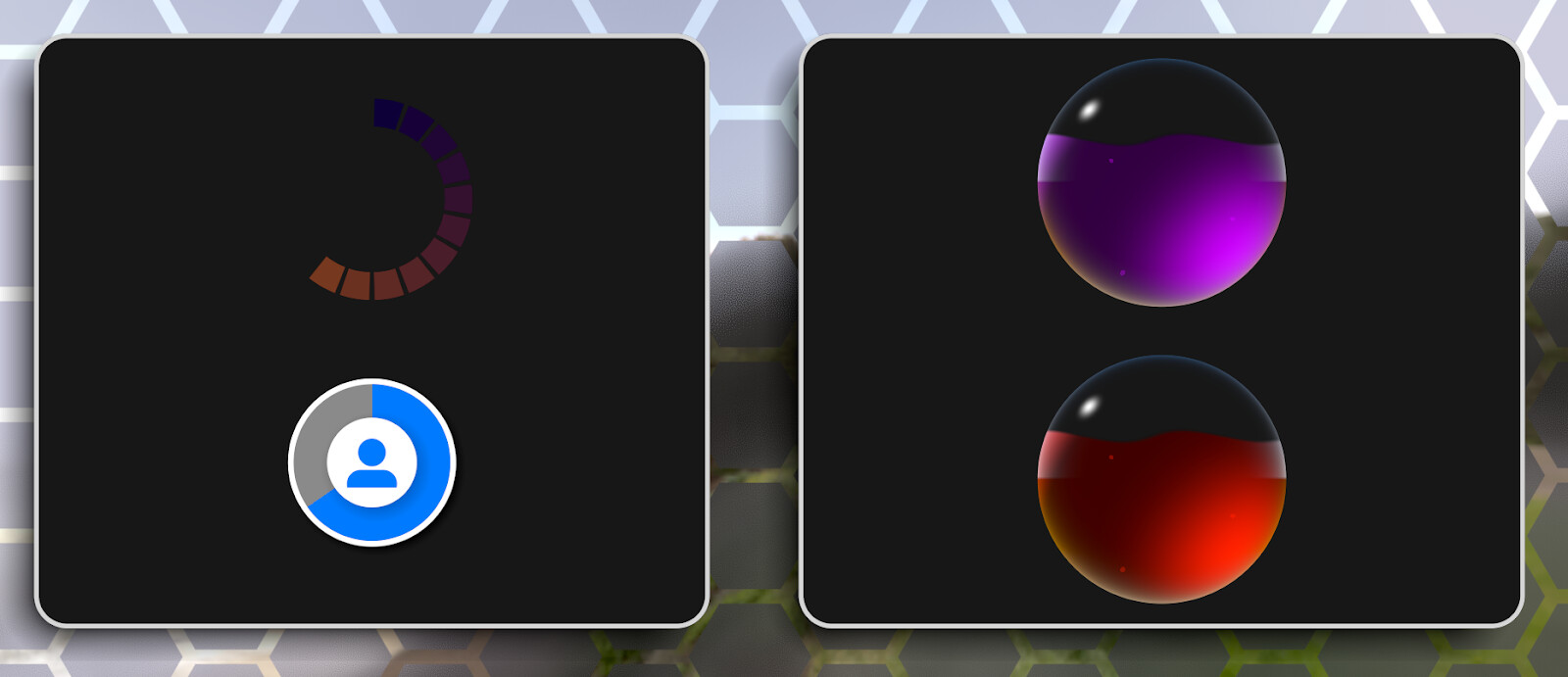
Indicators - Indicators are UI elements that ask the user to wait temporarily while the game is saving or loading. They’re usually animated, but don’t require any connection to game logic, and are completely self-contained. These illustrate how these example elements can be made in Shader Graph with zero texture memory.
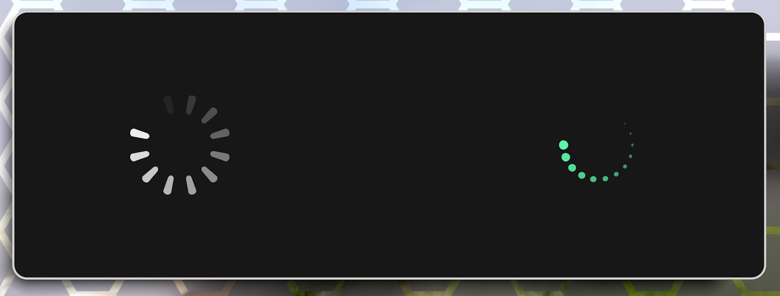
The Subgraph Library
This sample set contains a library of over 50 subgraphs that you can use to construct UI shaders. To create the subgraph library, we’ve taken a large set of commonly used functionality and encapsulated them as subgraphs. You can build UI shaders easily by connecting these subgraphs together as building blocks instead of creating the functionality from scratch.
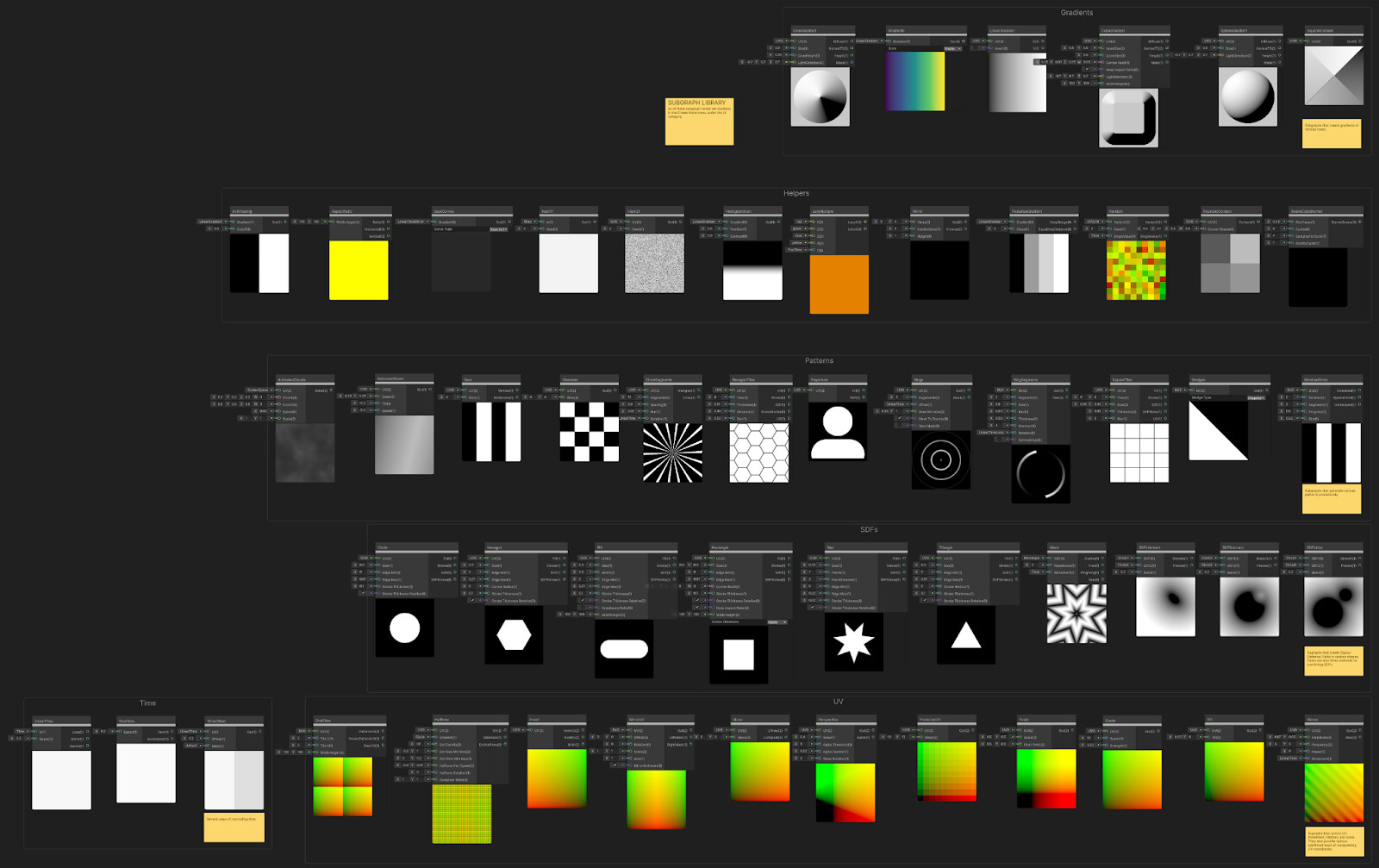
After importing the sample, these new nodes show up directly in the Shader Graph Add Node menu, so they’re easy to find and add in your shader projects.

Here’s a description of each of the categories of subgraphs:
Gradients - Shader Graph already ships with a very nice Gradient node, but these subgraphs extend the existing functionality by providing commonly used gradients including Linear Gradient, Sphere Gradient, and Square Gradient.
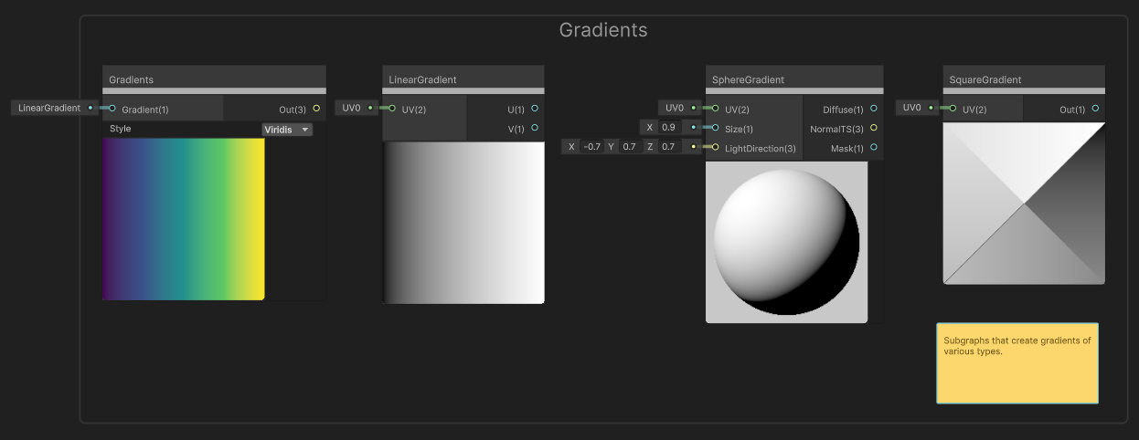
Helpers - This is a set of commonly used tools like random value generators, posterization, and ease curves. The most useful one - AntiAliasing - creates a perfectly sharp and anti-aliased shape that’s resolution independent when given a gradient or SDF.

Patterns - This set of subgraphs generates commonly used patterns that can be used directly or used as masks to create other shapes and effects. Patterns include Square Tiles, Hexagon Tiles, Circle Segments, Checkers, Bars, Animated Sheen, Ring Segments, etc.

SDFs - This is a collection of signed distance fields - procedurally generated shapes and tools for combining them. These are the foundation for creating buttons and meters that are resolution-independent.

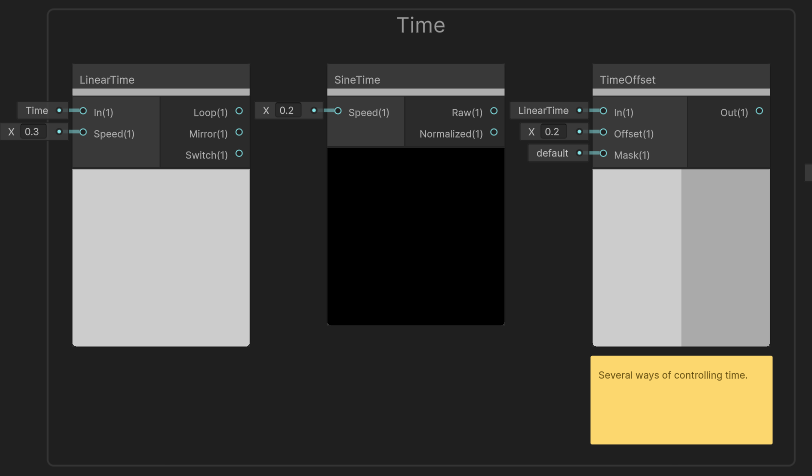
Time - These nodes provide time in various forms - Looping, Switching, Sine Wave, and offset using a mask.
UV - These nodes manipulate UV coordinates - tiling, mirroring, posterizing, shaking, tilting, etc.

How to Install
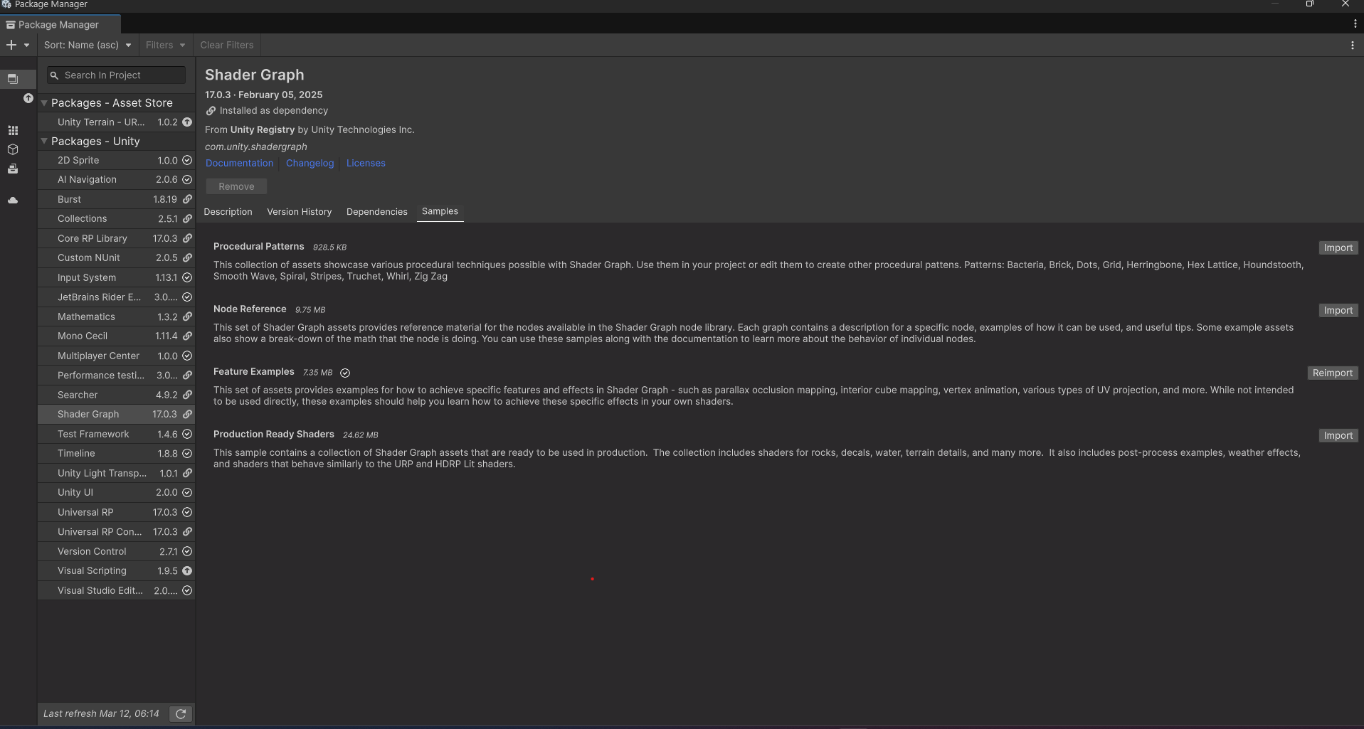
In the latest version of Unity 6, install the new sample assets using the Package Manager.
- In the Editor, open Package Manager.
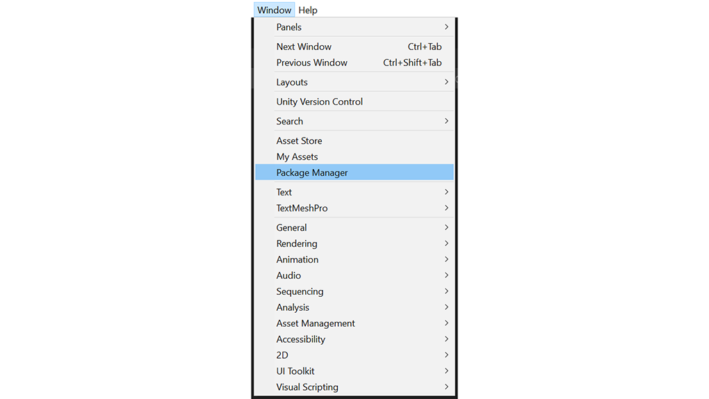
- In the Package Manager window, select the Shader Graph package.

-
Select the Samples tab.
-
Finally, select the UGUI Shaders Import button to bring the new UGUI Shaders sample set into your project.

With these steps completed, the UGUI Shaders sample will show up in your project under
Assets/Samples/Shader Graph/-your version-/UGUI Shaders
After importing the samples, get started by opening the sample scene:
Assets/Samples/Shader Graph/-your version-/UGUI Shaders/Scenes/UISampleScene
We’d love to hear what you think! Share your thoughts and comments here in the forum.